In recent years, Major League Baseball has experienced a boom in home runs. Anyone who remotely follows the game likely know this fact. Many possible explanations have been put forth: the baseball is juiced, hitters might still be juiced, swing angles are steeper, etc. As with most situations in life, the explanation is likely a confluence of factors. Silver bullets are rare.
This blog analyzes the recent spike in home runs, providing necessary historical context. Perhaps the increase in home runs is not surprising in a statistical sense. However, possibly the results are unanticipated. We shall see.
Data from 1871-2018 was sourced from the Lahman database. Observations from 2019 were obtained via a webscraper, as the Lahman database does not yet include 2019. Ingesting and wrangling code was authored in Python, which can be viewed on GitHub. Visualizations and time-series models were constructed in R.
Exploratory Data Analysis
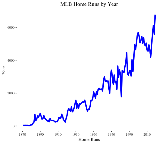
Home runs follow an upward trend. Nothing surprising here. Of note, we do observe a decline in home runs leading up to the spike in 2016.
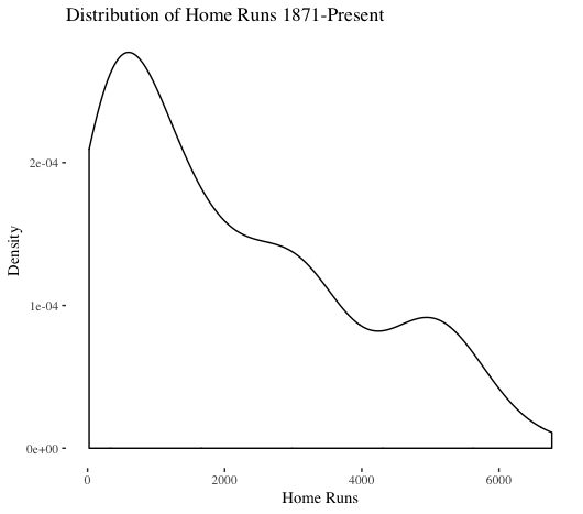
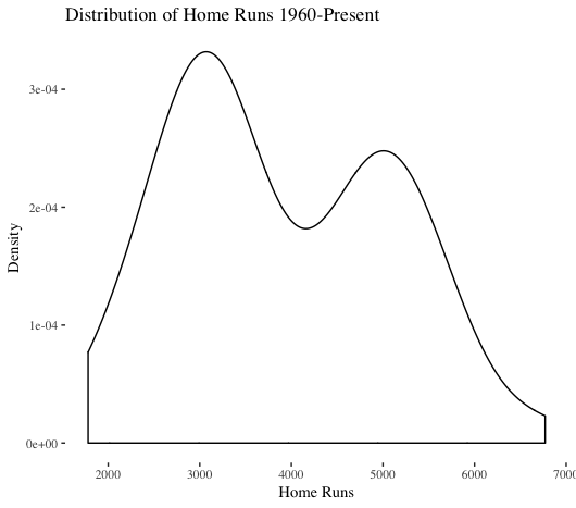
The distribution of total yearly home runs is not normal (this visualization does include the 1981 and 1994 strike years, but those do not have too major of an impact). Interestingly, a depression exists in the middle of the distribution. Looking at modern times (1960-present) is instructive to better understand recent context. As shown above, a plot of 1871-present is dominated by the dead-ball era.
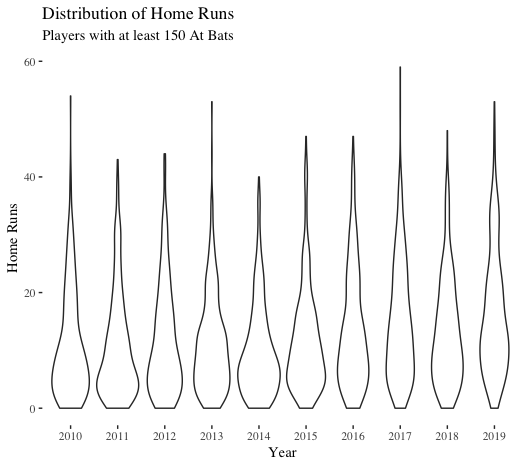
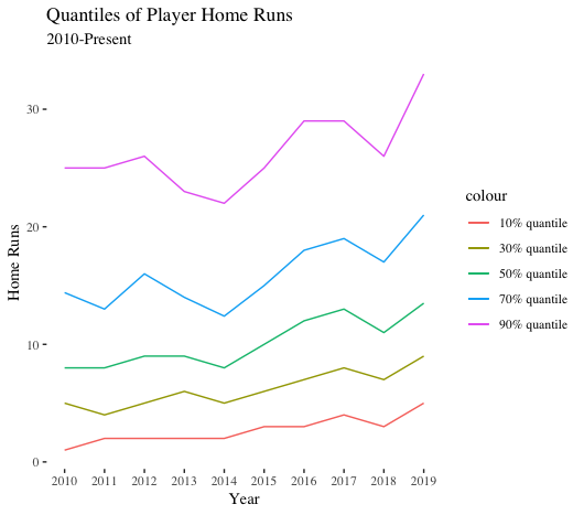
We now pivot to home runs on a player level. If we zoom in on 2010-present, we see an interesting pattern: starting in 2016, the distributions of player home runs are thinner That is, fewer players are concentrated at the bottom-end of the home run distribution. In other words, more players are hitting more home runs.
CDFs and PDFs
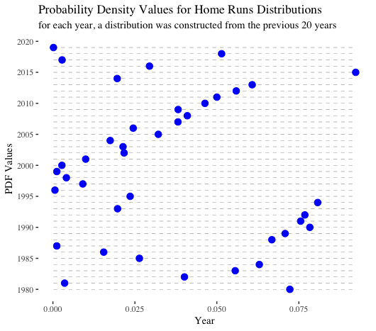
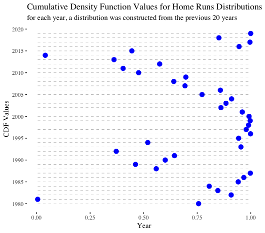
For the next two visualizations, we generated a rolling series of normal distributions. For every year between 1980-2019, the mean and the standard deviation from the previous 20 years (not including the year in question) were calculated and then used to create a normal distribution. Then, that distribution was leveraged to calculate the PDF and CDF of the home run value from the given year. If 1981 and 1994, the strike years, were included in the year range, we reached back another 1-2 years to ensure we always considered a 20-year timeframe. Those two years were excluded from calculating means and standard deviations.
PDF stands for probability density function. At a high level, it displays the likelihood of observing a given value considering a specified distribution. For example, given the mean and standard deviation of home runs between 1998-2018 and assuming a normal distribution, the probability density of observing 6,776 home runs in 2019 was nearly 0. That is, it was quite unlikely. Probability density is not the same as probability. For our purposes, we can glean insights by comparing the relative values. Overall, the most “surprising” home run totals occurred between 1995-2000. Home run totals in 2017 and 2019 also had quite low probability densities.
CDF stands for cumulative density function. A CDF shows the probability that, given a distribution, observations will fall below a value in question. For example, for the 2019 number of home runs, we observe nearly a ~99% chance that a random choice from the foregoing 20-year distribution would be lower. In other words, through the lens of recent historical context, 2019 performance was unexpected.
The below charts are useful, though the analysis makes one key assumption: yearly home run totals are normally distributed. As we observed previously, this is not quite the case. However, the normal distribution has nice properties, and we like to use it when we can. Therefore, our analysis is not bulletproof by any means, but it still could provide useful directional takeaways.
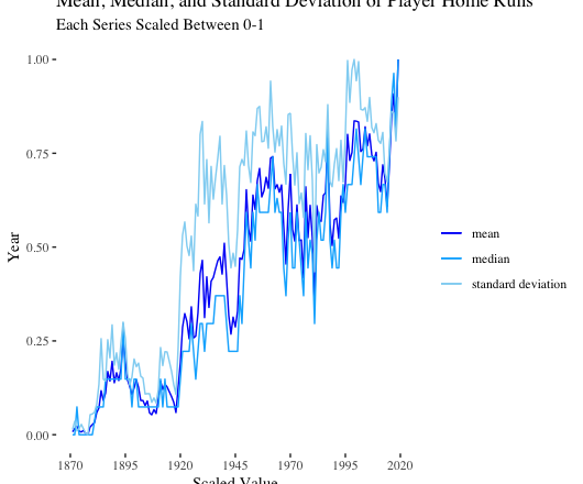
Summary Statistics over Time
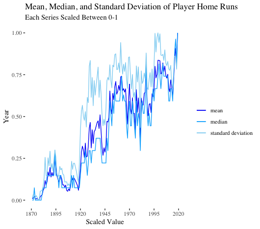
As expected, the mean, median, and standard deviation of player home runs follow the aggregate trends we previously observed.
Breaking down quantiles of home runs in recent years is more instructive. Across the board, all values are trending upward. That is, players with the least amount of power are hitting more home runs. Players with a medium amount of power are blasting more bombs. And top power hitters are launching more round-trippers as well. A rising tide is lifting all batters. (To note, power is relative over time. A medium power hitter could be a big power hitter if transported to another time).
Time-Series Modeling
Lastly, we fit time-series models on the data. Our goal was to develop a model to predict home runs in the years 2016-2019. If our models can accurately predict these years, perhaps the home run spike is not so shocking.
We first fit a classic time-series model known as ARIMA. Running a Ljung-Box test on our training data (1900 – 2015), we observe our data has serial autocorrelation. To fit an ARIMA model, our data must be stationary. That is, the mean and variance should not change over time. Let’s start by taking the first difference of the series, which is the series change from one period to the next.
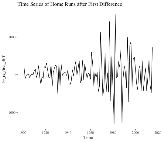
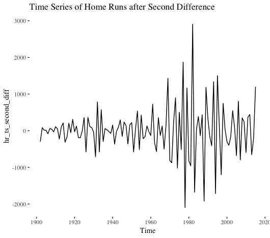
Nope. Not stationary. What about the second difference?
No dice. Let’s instead take the log of the series and then calculate the first difference.
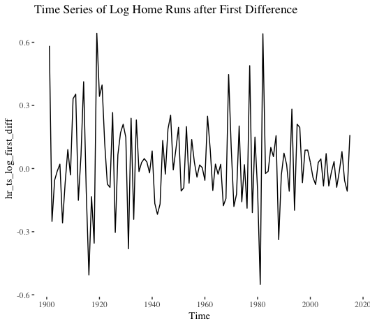
That looks better. Based on the eye test, we might think this series is still not stationary. However, the Ljung-Box test indicates no serial correlation exists. Better yet, the Dickey-Fuller test suggests the series is stationary. (I used 10 lags in the LJB test, and the ADF implementation in the aTSA package in R defaults to four lags).
For our log series, we know we need to take the first difference. What about the autoregressive and moving average terms for our ARIMA model?
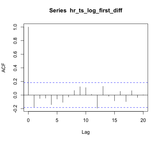
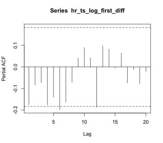
Based on the ACF, our model should include one AR term, meaning we should have at least an ARIMA(1, 1, 0). Based on the PACF, we could maybe add a MA term. To help with this decision, we can use the R forecast package’s auto.arima() function to select the best model.
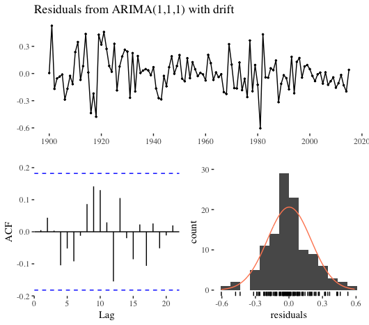
auto.arima() selected an ARIMA(1, 1, 1), and the diagnostics are shown below. The LBJ test indicates our residuals have serial autocorrelation; however, this might very well be the best fit we can muster with an ARIMA model.
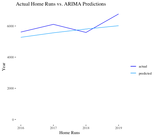
Next, we used our ARIMA model to predict on our test set, 2016-2019. Since our training data was on a log scale, we simply needed to exponentiate our predictions. As we can see, our ARIMA model performs OK. It under-predicts 2016, 2017, and 2019, while over-predicting 2018. The mean absolute error for the model was 463. Given this level of performance, the spike between 2016-2019 did not come completely out of the blue: an increase was predicted. Our model predicted 5,273 home runs in 2016 (actual was 5,610), an increase over the 4,909 bombs in 2015. That said, 2019 performance does appear a bit anomalous.
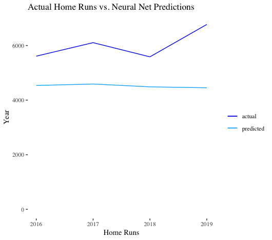
Lastly, we tried our hand at a neural network autoregressive model. Essentially, the lagged values of the time series are the inputs in our neural net. As we can see, the model performs poorly – it doesn’t extrapolate.
Summary
Overall, the analysis results are a mixed bag. On one hand, the increase in home runs has been noticeable and widespread across all types of hitters. On the other hand, given recent context, the spike in home runs was not completely unforeseeable to statistical models, even a simple one like ARIMA.