Earlier this season, my beloved Royals got off to a terrible start. Through 40 games, they were 14-26. The organization said they would be competitive in 2022, and some held out hope for an in-season turn around. Late in the season, the Royals stand at 58-89. The turn around did not happen.
The early-season struggles made me ponder: How early can we “write off” a team? In other words, when is a team’s end-of-season winning percentage predictable? Clearly, a number of factors can impact this research question. However, I wanted to narrow the focus: When is a team’s final winning percentage predictable, only given their current winning percentage and how far along they are in the season? To answer our research question, I built a machine learning model to predict teams’ end-of-season winning percentages.
The Code
If you want to follow the technical implementation, you can refer to this GitHub repo.
The Data
I pulled daily win-loss results for every team going back to 1970. I trained the model on games from 1970 – 2018 and evaluated the model on games in 2019 and 2021. Of note, I excluded the shortened seasons of 1981, 1994, and 2020.
For the technically inclined, I employed a custom time-series cross-validation scheme to prevent leakage. For the less technically interested, when training a model with time-sensitive data, we must evaluate performance using data that came sequentially after our training data. In other words, if we train a model using data from 2010, we should only evaluate it using data from 2011 and after. In this problem, we can train our model on a set of years and then see how well it performed on future years.
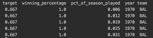
The below is what our data looks like – it’s a snapshot of the 1970 Baltimore Orioles. (Remember, we have all teams’ games since 1970 in our data, excluding a few choice years). Their ending winning percentage is 66.7% (or 0.667). In the first row of data, after they played their first game, they had a winning percentage of 100% (or 1.0), and they had played 0.6% (or 0.006) of the season. Given the winning_percentage and pct_of_season_played columns only, we want to try to forecast the target (the season-end winning percentage), given the results after every game in a team’s season.
Model Performance
How well does our model perform? That’s an interesting question. We would rightly expect our model to be poor early in the season but be quite accurate late in the season. For example, given only the data we are using, our model should be terrible after game 1 but terrific after game 161. In aggregate, here is how we shake out.
| Metric | Score |
| Median Absolute Error | 0.0279 |
| Mean Absolute Error | 0.0389 |
| Root Mean Squared Error | 0.0533 |
Our median error is 0.0279. To illustrate, if we were to predict a winning percentage of 0.60 (60%) and the actual value was 0.6279, that would be an absolute error or 0.0279. Overall, these are solid numbers. However, the performance looks inflated because some predictions are super easy (think predicting the final winning percentage after game 161).
Model Performance by Partition
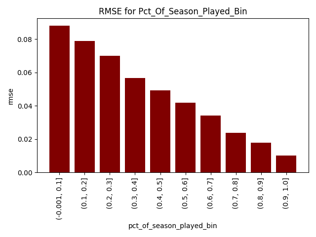
The chart below bins the pct_of_season_played feature into 10. We can see, as expected, our error goes down steadily as teams play more games. Early in the season, our errors are comparatively high. Later, we will see how the model hedges early in the season. To note, I am using root mean squared error (RMSE) as it is a more “severe” measure of predictive performance.
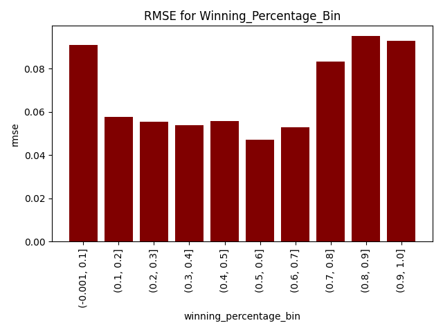
Likewise, we can see that we experience the worst predictive performance when teams have abnormally high or low winning percentages. This is because these extreme streaks cannot hold forever, and regression to the mean will eventually kick in. The chart below, again, present a version of the variable in 10 bins.
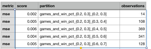
Additionally, we see there can be some differences in predictive ability based on the combination of winning percentage and games played. The below table shows the MSE (from which the RMSE can be easily derived by taking the square root) of predictions for observations where the season was 20-30% complete. The second set of numbers you see in the partition column below (e.g., 0.3, 0.4 … 0.4 , 0.5 …) is a winning percentage bin. It’s challenging to derive a specific pattern, though we can state that some fluctuation exists as we vary both features together.
What Influences Predictions
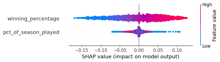
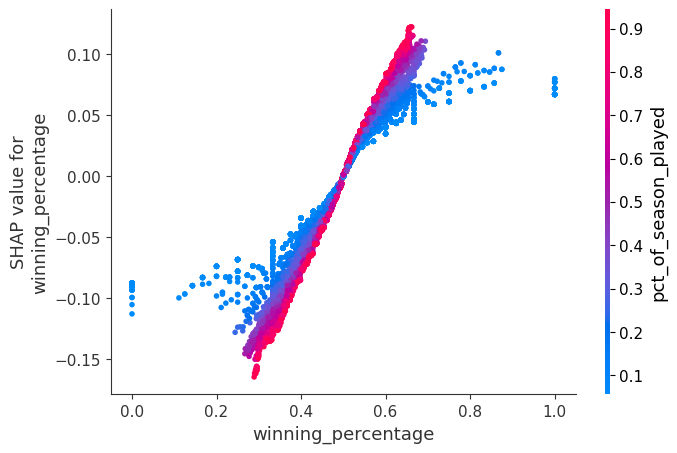
On a global scale, we can also observe how our variables influence predictions. In the chart below, every dot represents a game in either 2019 or 2021, our evaluation period. As the current winning percentage increases (dots go from blue to red), the predicted season-end winning percentage also increases. When inspecting pct_of_season_played, if we are early in the season (blue dots), that will either notably increase or decrease our predictions since situations as especially tentative early in the season. The model can strongly counteract abnormally high or low early-season winning percentages by moderating based on pct_of_season_played. As a team plays more games (red dots), the influence of pct_of_season_played is muted and the winning_percentage feature becomes more influential. This all makes intuitive sense. (To note, SHAP is just a measure of how and how much a prediction is impacted by features).
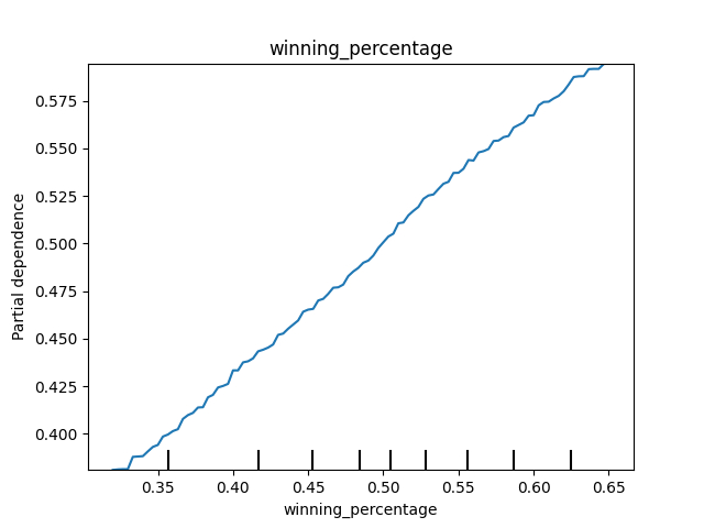
If we were to hold pct_of_season_played constant and increase winning_percentage, we would see that our predicted season-end winning percentages go up linearly. Again, this makes perfect sense. Higher winning percentages now often predict higher winning percentages in the future.
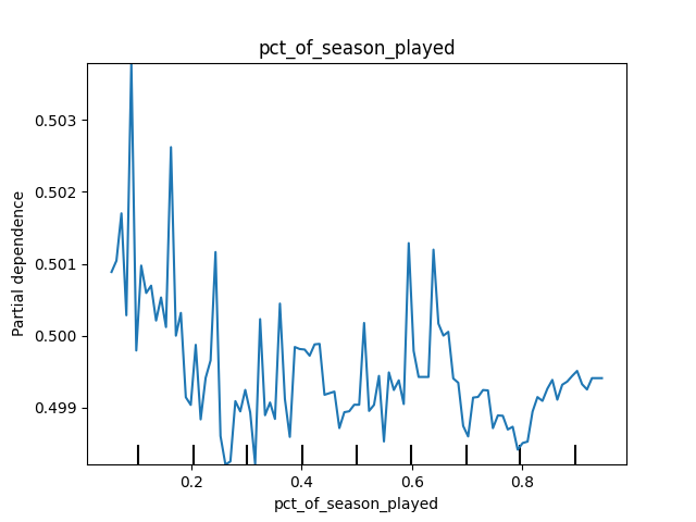
If we were to hold winning_percentage constant and increase pct_of_season_played, though, we would see a noisy pattern. Also, in the chart below, you can see there is very little difference between the values on the y-axis! (The axis might be a little misleading, but this is the default from scikit-learn. I left it here as a teaching moment). These results again make sense. The pct_of_season_played on its own doesn’t tell us much about how much a team will win. It’s mostly meaningful in interaction with winning_percentage – we have to know the current winning percentage at some point to make any sort of accurate prediction.
We can also view the interplay between features using SHAP. This can be a lot to take in, but here is my summary. After a certain point in the season (purple and red dots), the relationship between current winning percentage and season-end winning percentage is linear. However, early in the season (blue dots), the effect is altered since “weird things happen in small sample sizes”. Visually, when the values are blue, the effect gets pulled away from the linear line and the slope becomes flatter. The model moderates predictions early in the season. This is fascinating and yet intuitive.
A Time-Series Look at Predictions
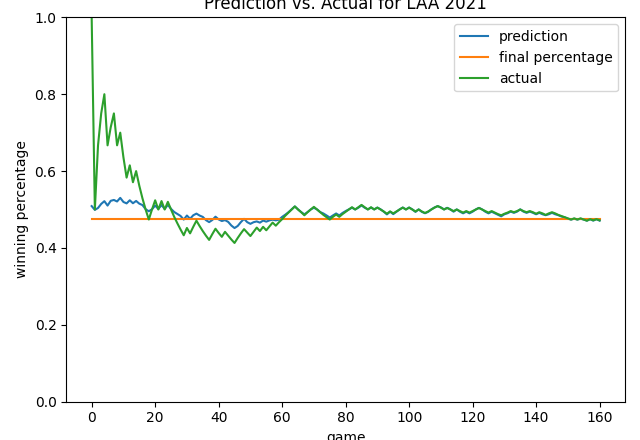
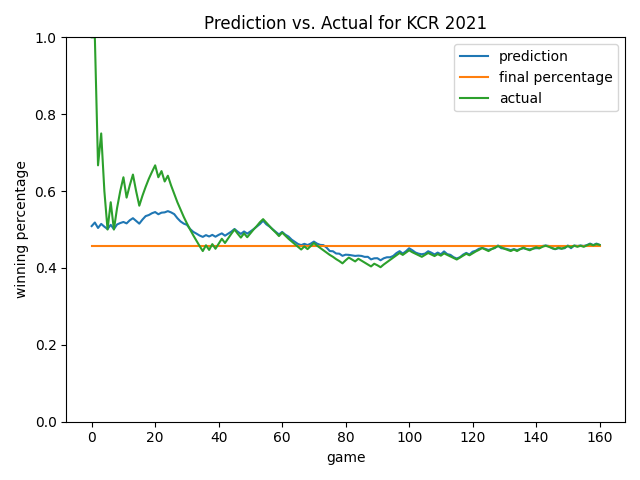
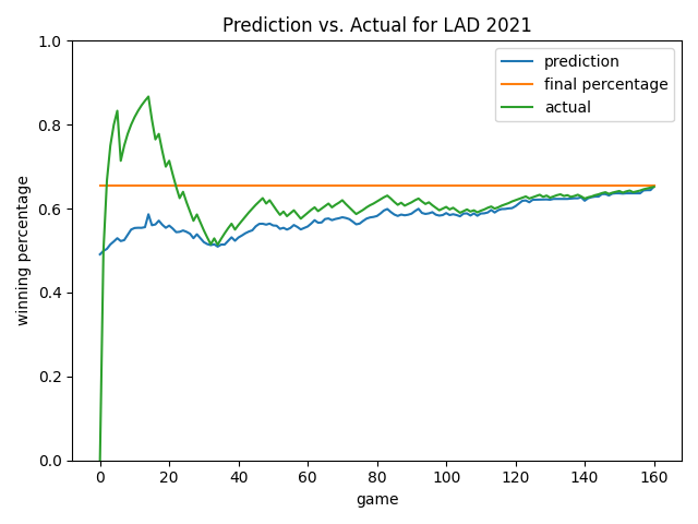
Let’s take a look at daily predictions for the Royals in 2021. We can see the model isn’t influenced by a lot of the noise early in the season. This is good! At around game 40, the actual and predicted winning percentages normalize to one another. In the second half of the season, the prediction converges well to the final winning percentage, especially after game 120.
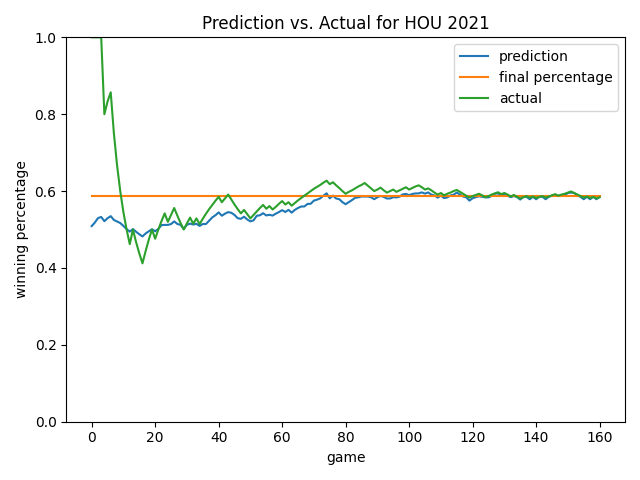
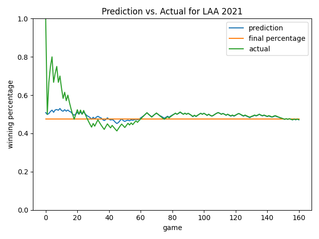
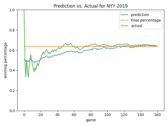
Below are some more views. As you will notice, the model always starts by predicting a roughly 0.500 record. This is smart since average would likely be our status quo – the model learned this point on its own! Overall, I like how the model ignores early-season noise. In the Angels chart, it’s cool how the model predicted a rebound that eventually happened (see games 20-60). In many cases late in the season, the model will predict the ending winning percentage to be the current winning percentage…but not always! See the 2019 Yankees chart as an example until we get quite late in the season. As we’ve already learned, at a certain point, how good you are prevails and is the best predictor of how you will end the season.
2022 Projections
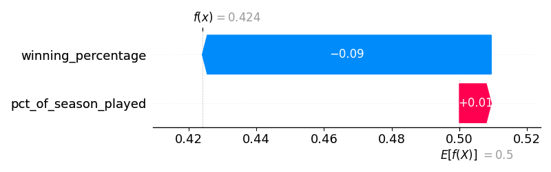
We can also see how the model would have made predictions live in 2022 after every game. As I am writing this, the Royals are on my TV…and they have a winning percentage of 0.395. Twenty-games into the season, the model would have projected a 0.424 winning percentage. Not a bad prediction. The chart below shows how their winning_percentage and pct_of_season_played values moved them away from a baseline of being 0.500 and to a prediction of 0.424. Since they were off to such a poor start, the model dinged them quite a bit based on their winning percentage alone.
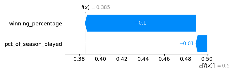
After 40 games, the predicted ending winning percentage was 0.385.
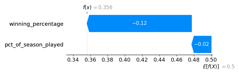
After 60 games, the predicted ending winning percentage was 0.356. (At this point in the season, the Royals were absolutely awful).
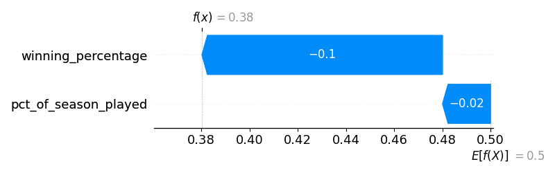
After 80 games, the predicted ending winning percentage was 0.380.
Overall, these are realistic predictions! They are good…without being too good to be true. We have a simple, realistic, and usable model.
Below are projections at the 80-game mark for the Dodgers. Right now, their winning percentage is 0.699 since they have absolutely dominated the second half. We can say their dominance is so impressive because it was much stronger than forecast.

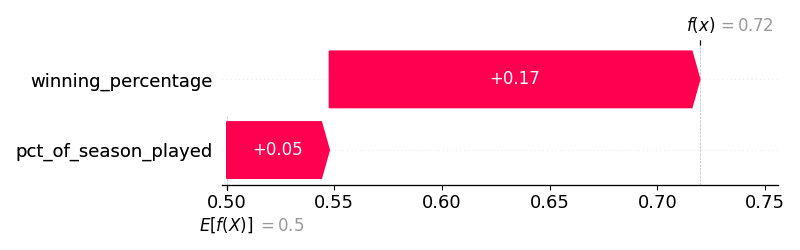
At the 80 game mark, the model had the Yankees at a 0.72 projected winning percentage. This was believable given they were so amazing in the first half. However, they now stand at 0.603. We can say their second-half collapse has been, well, so bad because it was not at all forecast.
Conclusion
So when does a season become forecastable, given only current performance and how far along we are in the season? My friend, it depends. See all the work above.