Who will win the World Series? That is the classic question asked before the start of every MLB season. As with many baseball questions, a data science answer exists. In this blog post, we review a machine learning model to predict World Series winners, using only data from previous years.
The Data
The data came from the Lahman database. Our model includes two main types of features: team stats and roster stats. Team stat features concern postseason results and winning percentages for the previous five years. For example, one feature is the rolling five-year winning percentage and another is the winning percentage in the previous year. The roster stats include the median OPS, the median ERA, the average age of pitchers and of batters, and the number of all-star appearances by pitchers and by batters. On all of these stats, we must be sure not to induce feature leakage. If we want to predict the 2020 World Series, we should only use data from 2019 and before.
However, there is one issue with the data of which we should be aware. Using only the Lahman database, we cannot necessarily tell if a player started the season on a team’s MLB roster. If a player was traded intra-season, we can be sure their stats are assigned to the original team. That said, there could, of course, be cases where a player doesn’t even make the 40-man roster in March but gets a September call up. If we were to run the model in March of that year, the model wouldn’t factor in that player’s stats. However, if we were to run the model again in September, it would factor in that player’s stats as that player would now appear on the roster. When making predictions for 2021, this will be a point we want to remember. Likewise, when reviewing the test set, we are not perfectly testing predictions that would have been made at the start of the season. As discussed above, we are careful about how we wrangle the data, so we are still fighting data leakage pretty strongly (i.e. if we are predicting 2020, we don’t use any stats garnered in that year). Given the limits of the data, we’re not perfect, however. All that said, the impact very likely isn’t going to spoil the model, especially since we’re taking medians of roster stats like ERA and OPS, which will be more resistant to outliers. Likewise, the effect of late-season call ups will wash out for several teams but not all. It could widen the gap between strong and weak teams, as they latter will likely have more late-season call ups that will actually play. Additionally, as you’ll notice, team stats tend to be most predictive, and they don’t suffer from any leakage.
If we want to fix this issue, we would need a more granular data source, perhaps Retrosheet. One of the hallmarks of data science is recognizing the potential stumbling blocks of our model, communicating them, and identifying what we can do better in the future.
The Model
We ran a series of tree-based models. The models were trained on 1905-2016, and 2017-2020 data was used for validation. For each team for each year the club was active, the model predicts the probability of winning the World Series, again using only data through the end of the previous year.
The best model was XGBoost. Since we’re only using four years of data in our test set, we only have four positive observations. We, therefore, need to be careful when inspecting our evaluation metrics. However, we can get some good insight from our ROC AUC of 0.80. We can interpret this metric as the following: If we were to pick a random World Series winner and a random non-World Series winner, there is an 80% chance the World Series winner would have a higher predicted probability of being the champs. However, this metric does not account for picking random observations within the same year, which makes more intuitive sense. Therefore, the ROC AUC is probably a little optimistic.
To note, these model are uncalibrated. There just isn’t enough data to use scikit-learn’s CalibratedClassifierCV. However, the cardinality of the predictions is still valid, and the calibration is likely pretty decent out-of-the-box.
Model Predictions
Let’s inspect some of our model results, taking 2020 as an example. Here are the top 5 teams predicted to win the 2020 World Series.
| Team | Predicted Probability of Winning World Series |
| Astros | 32% |
| Dodgers | 25% |
| Yankees | 25% |
| A’s | 21% |
| Twins | 17% |
These seem like pretty solid predictions. The Astros lost the ALCS in 7 games. The Dodgers won the World Series. The Yankees and the A’s lost in the ALDS. The Twins made the playofffs.
We shall also inspect the bottom 5 teams predicted to win the 2020 World Series.
| Team | Predicted Probability of Winning World Series |
| White Sox | 0.4% |
| Pirates | 0.4% |
| Orioles | 0.4% |
| Tigers | 0.2% |
| Marlins | 0.2% |
This is more of a mixed bag. The Orioles, Tigers, and Pirates weren’t very good. The Marlins were solid after being terrible in 2019, which explains why the prediction was so low for 2020. The White Sox were also pretty decent. Of course, 2020 was anomalous, but this model still should mostly hold.
In terms of other years, the Nats were given a 14% probability of winning the World Series in 2019 and ranked as the fourth most likely team to be crowned the champs. For 2018, the Red Sox were given a 6% chance of winning the World Series, the 6th highest rank for that year. The model missed in 2017, ranking the Astros as the 13th most likely team to win the Series.
Prediction Drivers: SHAP Values
SHAP values allow us to decompose how a tree-based model arrived at its prediction, giving us both global and local prediction explanations. They show feature importances in a smarter way compared to the default metric (e.g. mean decrease in gini).
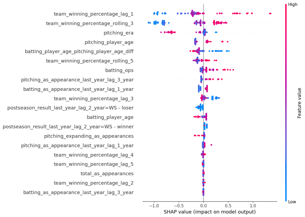
Below are the SHAP values for the XGBoost model. The SHAP impact is shown on the x-axis, which is the influence of moving a prediction away from some base value (e.g. the overall positive class rate). Each dot represents an observation in the test set. The colors represent high vs. low values for that feature. For example, we see that high winning percentages in the previous year tend to increase the probability of winning the World Series, and low values have the opposite effect. This makes sense. Likewise, we also observe that high ERAs drive down the probability of winning the Series. Again, this makes sense. In general, we observe that the predictions are mostly impacted by 10-12 features (to note, not all features are displayed in this chart). In general, recent winning percentages and all-star appearances along with ERA, OPS, and player ages have most influence.
As you might have noticed, the SHAP impact is not a probability, which is an artifact of using a boosting model. For a bagging model like Random Forest, the x-axis corresponds to a probability. XGBoost does not record how many samples passed through each leaf node; it only notes the sum of the hessians.
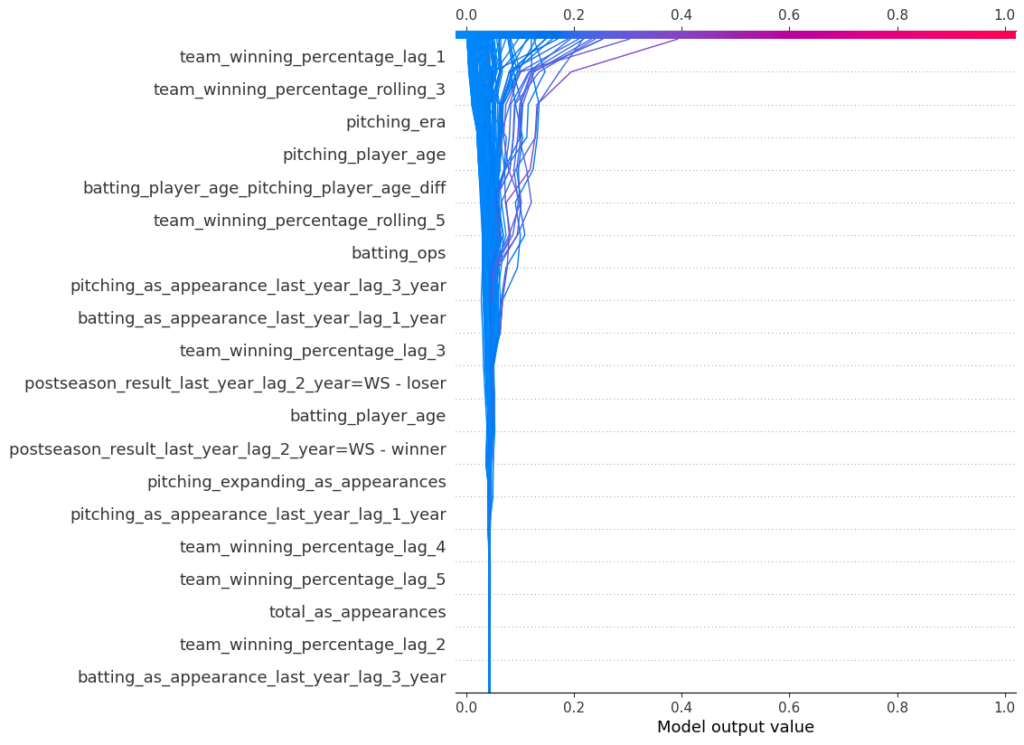
Another way to represent the SHAP values is via a decision plot. By default, the x-axis is in log odds, but we’re able to transform it into probabilities in this visualization. Each line represents an observation from our test set. As we move from bottom to top, the SHAP values are added, which shows each features’ impact on the final prediction. At the top of the plot, we end at each observations’ predicted value. This chart tells us the same information as the previous plot, only in a different way.
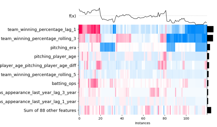
Likewise, we can visualize our SHAP values as a heatmap. Similar observations are grouped on the x-axis. The prediction function is shown as a line across the top, and the colors correspond to the SHAP values. We can see that, for instance, predictions impacted by last year’s winning percentage tend to also be impacted by the rolling three-year winning percentage. In the middle of the chart, we also observe that many observations are not swayed far from the base value as the SHAP values are low.
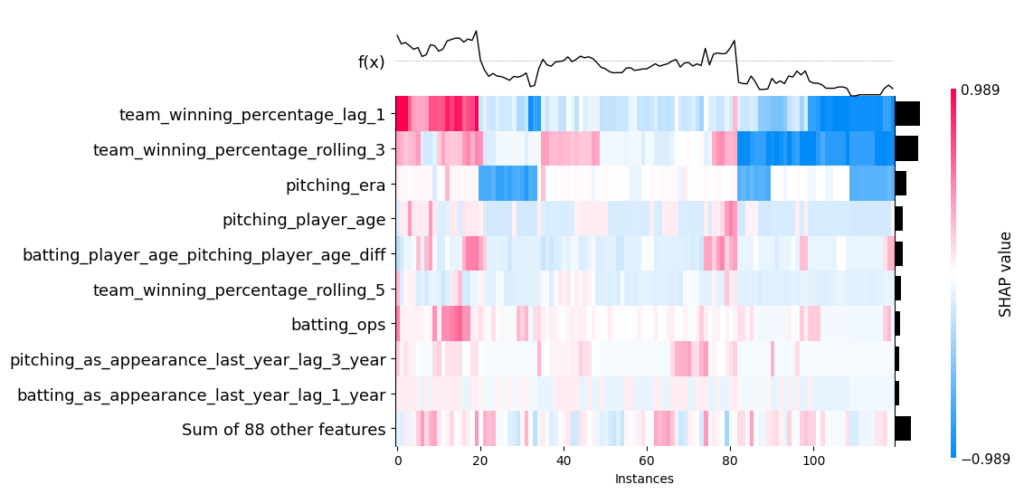
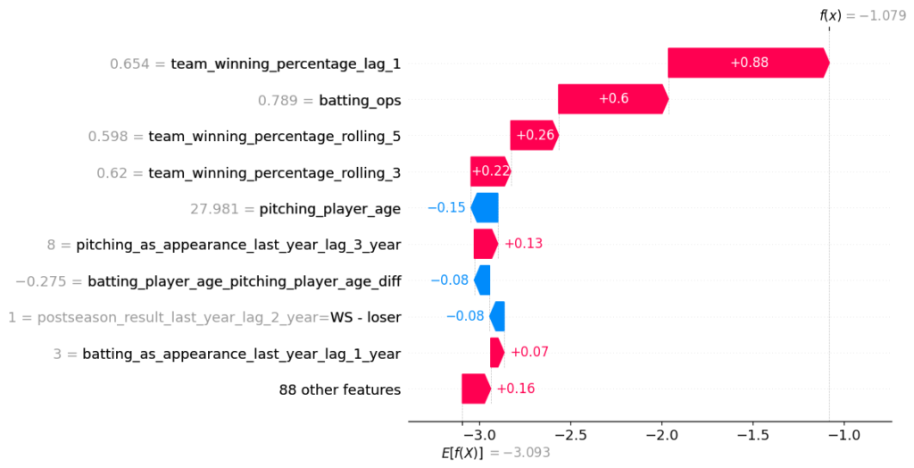
We can also decompose an individual prediction. We shall do so for the 2020 Dodgers. We notice the team’s recent success and the median OPS have the largest impact. It bodes well that the directionality of the features makes sense. To note, pitching_as_appearances_last_year_lag_3 represents how many total all-star appearances the pitchers racked up in the previous three years.
PDP and ICE
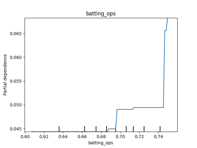
Partial dependence plots (PDP) show how predictions change, on average, as we vary a certain value in a simulated scenario. For instance, as we increase the median OPS, what happens to the predictions? Well, we can see that once the median OPS hits about 0.750, the probability of winning the World Series increases.
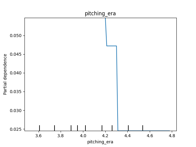
What about ERA? We see that the probability of winning the World Series starts to plummet once the median ERA gets above approximately 4.30.
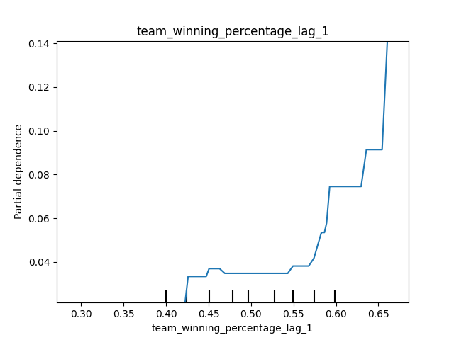
Likewise, we observe that a winning percentage in the previous season above 55% clearly drives up the probability of being crowed the champs.
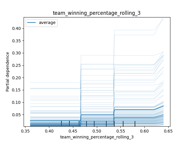
An ICE (individual conditional expectation) plot is a little different. Rather than showing the average effect, it shows the effect for each individual observation as we vary the value of the feature in a simulated scenario. We get the PDP by averaging the ICE. For the rolling three-season winning percentage, we observe the same general effect for each observation. However, the effect of a winning percentage greater than ~62% appears to be pronounced for observations with already-high predicted probabilities.
We should also be aware of ALE (accumulated local effects) plots. These can perform better when features are correlated. For brevity, we won’t show them here (they are also pretty boring for this problem).
Who Will Win in 2021?
That’s the big question. Don’t worry: it will be covered in an upcoming blog post.