Welcome to blog number three! This piece seeks to cluster MLB teams based on their offensive and defensive stats.
I used the teams dataset in the Lahman R package for this project. This dataset includes 40+ offensive and defensive stats for teams dating back to 1871!
Data Preparation
Although the original data set included 48 variables, I only incorporated 19 features in the final analysis. Items like attendance and number of home games are not useful in helping us understand on-field performance. The final selection of features included staple offensive statistics like runs, home runs, and stolen bases as well as standard defensive measures like errors and strikeouts. See the code on GitHub for the full list of final variables.
Additionally, all of the data points in the original teams dataset were aggregates, and since teams have not always played 162 games in a year, I made all features a per-game measure (thank you to R’s handy sweep feature). I also deleted the teams that had missing values, hence the “(almost)” in the post’s title. To note, I realize that making some variables, like shutouts, a “per-game” measure is a bit awkward; however, scaling those variables in such a way makes them comparable and allows them to be retained in the analysis.
Data Exploration
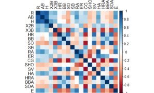
To explore the data, I first started with a simple correlation matrix. Some of the correlations we see are likely due to how the game has changed over time. For example, offensive home runs are negatively correlated with complete games. Intuitively, this makes sense – modern teams hit more home runs but throw fewer complete games compared to teams from decades gone by. Therefore, when we cluster teams later in this blog, I expect teams of the same era to often be categorized together. With this in mind, pinpointing teams that are clustered with ball clubs of different eras will indicate they are special – in good or bad ways – from their contemporaries.
I also looked at the relationship between a couple of key metrics. Because we have a large number of data points, I didn’t want to over-plot the data, so I binned the scatter plots.
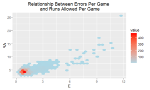
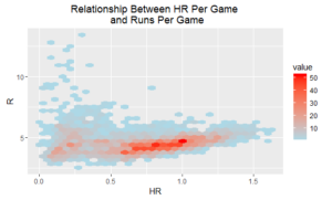
OK, so we see a relationship between errors per game and runs allowed per game, although the connection between home runs per game and runs scored per game is a bit more complicated to interpret. There appears to be a slight upward trend in regional parts of the data, but there is certainly a large system of exceptions.
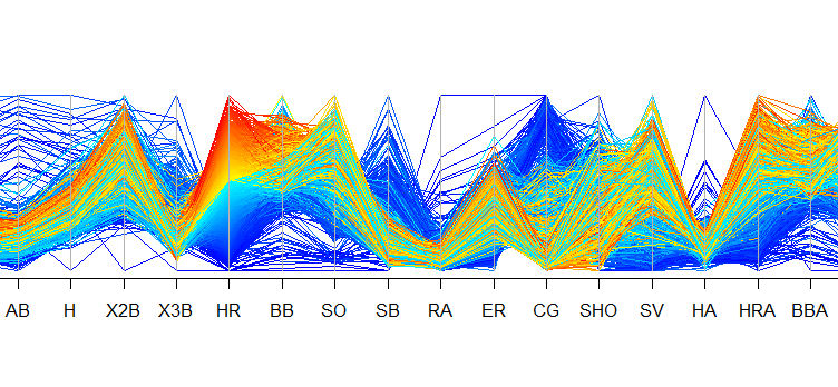
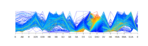
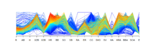
I wanted to drill a bit deeper, so I constructed two parallel coordinates plots. The first plot segments teams based on their number of shutouts. The second segments teams based on their number of home runs. In general, we can see that teams with the most shutouts (highlighted in red and yellow in the top plot) also had low runs allowed, earned runs, and home runs allowed as well as comparatively high complete games. Not surprising. In terms of teams that hit the most home runs (highlighted in red and yellow in the second plot), we see they ranked high in number of doubles, and they also tended to strike out more (these are only a few interesting observations). Again, some of these relationships are due to how the game has changed over time.
K-Means Clustering on Teams Data
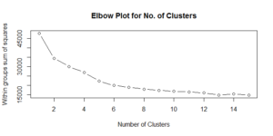
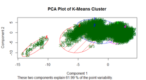
Now, it’s time for the main show: clustering teams. The scree plot of within groups sum of squares is a little difficult to interpret. To my eye, it seems the improvements become less drastic after five or six clusters. For this exercise, I opted for six clusters. The PCA plot below visualizes the results of the six-cluster solution.
Below is a summary of the cluster results, calling out a selected number of metrics. For full descriptive statistics on each feature broken down by cluster, you can re-run my code. (Apologies for the duplicative language that follows).
Cluster 1: 824 teams from mostly the 1960s-1980s. These teams scored an average of 4.2 runs per game, smacked and an average of 0.79 home runs per game, struck out an average of 5.3 times per game, and allowed an average of 3.7 earned runs per game.
Cluster 2: 29 teams from mostly the 1870s. These teams scored an average of 9.0 runs per game, hit an average of 0.12 home runs per game, struck out an average of 0.64 times per game, and allowed an average of 4.1 earned runs per game.
Cluster 3: 472 teams from mostly the 1920s, 1930s, and 1940s. These teams scored an average of 4.8 runs per game, hit an average of 0.55 home runs per game, struck out an average of 3.3 times per game, and allowed an average of 4.1 earned runs per game.
Cluster 4: 194 teams from mostly the 1880s and 1890s. These teams scored an average of 5.5 runs per game, smacked an average of 0.26 home runs per game, struck out an average of 2.8 times per game, and allowed an average of 3.9 earned runs per game.
Cluster 5: 686 teams from mostly the 1990s-present. These teams scored an average of 4.7 runs per game, belted an average of 1.0 home runs per game, struck out an average of 6.7 times per game, and allowed an average of 4.3 earned runs per game.
Cluster 6: 306 teams spread from 1900 to approximately 1950, with a concentration in the 1910s and another notable pocket in the WW II era. These teams scored an average of 4.0 runs per game, smacked an average of 0.25 home runs per game, struck out an average of 3.6 times per game, and allowed an average of 3.0 earned runs per game. This cluster is particularly fascinating. Essentially, it tells us that, likely due to the MLB losing players during WW II, many teams were reduced to resembling clubs from 30 years prior.
An Excel file that shows what cluster each team falls in can be found on GitHub. What I find most interesting is the teams that are in a cluster of mostly ball clubs from a different era!
Hierarchical Cluster on Teams Data
I also conducted a hierarchical cluster on the data. The typical output of a hierarchical cluster is a dendrogram, shown below.
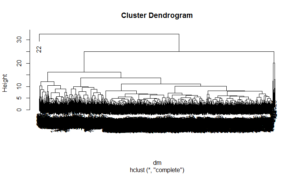
The dendrogram is pretty messy and impossible to interpret. However, we can zoom in on portions of it.
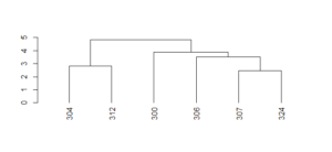
The numbers represent rows in our dataset. If we query, for example, rows 307 and 324, we see they correspond to the 1912 Reds and the 1913 Pirates. Therefore, we can say that the most similar team to the 1912 Reds was the 1913 Pirates!
Let’s zoom into one more area of the dendrogram.
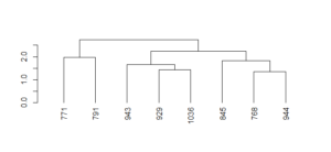
If we query rows 944 and 768, we find that the 1940 Giants were most similar to the…1951 Giants! With one exception, of course: The 1940 team didn’t have Bobby Thomson’s famous “shot heard ’round the world”!
Principal Components Analysis
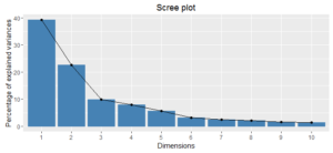
We did all of this work on 19 variables. Would it have been possible to cluster teams using a smaller number of variables? Possibly. To close the analysis, I conducted principal components analysis (PCA) on the dataset. Essentially, principal components are buckets that combine features to explain variability in data. In this case, the idea is to see if we could conduct the analysis with fewer than 19 variables and still retain the information contained in the original data.
Inspecting the chart below, we see that the first two principal components retain 62% of the variability in the data, and it takes seven principal components to capture 90% of the variability. So, it appears we could conduct the analysis, should we so choose, on a smaller set of features and still retain most of the variability from the original data.
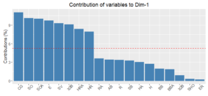
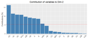
The charts below show the variables that contribute most to the first two components. In my view, these components don’t tell a cohesive story. If we restricted the analysis to recent decades, mitigating the effects of the game changing over time, these results could be quite different.
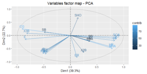
Lastly, I plotted a factor map, often called a biplot, of how the variables contribute to the first two principal components. Features that are close together on the map have similar impact on the first two principle components. For example, HRA and HA are both at approximately 0.75 on the x-axis (PCA 1) and at roughly -0.45 on the y-axis (PCA 2). And if we review the charts above, we notice that HRA and HR are right next to each other.
And that’s a wrap! Coming up, we’ll heavily dive into predictions using machine learning algorithms.