
Welcome back, readers! Are you ready for some more baseball data science fun?
This blog has two main components: 1) exploring aggregated data for each team from 1995 – 2015 and 2) developing a predictive model of variables that impact teams’ attendance. To date, this project has been the most intensive in terms of data ingestion and wrangling.
Data Ingestion and Wrangling
The data for this project came from Baseball Reference, which houses an unbelievable amount of historic baseball data. I created a web scraper to ingest per-season attendance, standings, pitching, fielding, and hitting statistics for each team from 1995 – 2015. If you’re interested in all the nitty gritty data wrangling and cleaning, see my code on GitHub.
Quartile Analysis
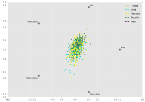
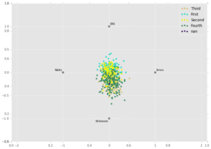
To begin exploring the data, I used the Pandas library in Python to create rad viz plots (see below). Each point on a plot represents a team from the past 20 years, colored by the win quartile to which they belong. The fourth quartile corresponds to the teams with the most wins, whereas the first quartile represents the teams with the fewest wins. The charts display how teams in different quartiles compare on different statistics. The goal is to see if any group is pulled toward a certain metric more than other groups.
The top plot shows how teams compare on five offensive statistics. It demonstrates that teams with the most wins are pulled more strongly to the hits section of the graph, indicating that – not surprisingly – teams with more wins collect more hits.
The bottom plot displays how teams compare on four pitching/defensive statistics. Not surprisingly, teams with more wins have pitchers that rack up more strikeouts, and teams with fewer wins have pitchers with generally higher ERAs.
Aggregated Team Statistics
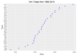
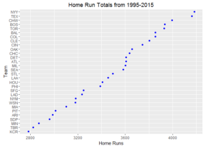
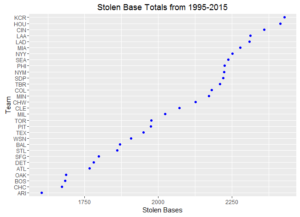
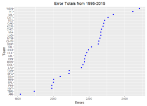
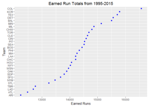
Ever wonder how your favorite team compares to other ball clubs? Here are some dot plots of aggregated team statistics from 1995 – 2015. To note, Arizona and Tampa Bay often have the lowest marks since these franchises both came into existence in 1998.
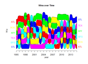
Alluvial Time Series Diagram
For one final visualization, I created an alluvial diagram to compare win totals of six selected teams over the past twenty years. If a team’s color is on top, then they had the most wins in a particular season.
Predicting Attendance – OLS Regression
During the analyzed 20-year span, MLB attendance totaled 1,492,344,734. What drove this many fans to attend games? To help answer this question, I created a predictive model to test which variables seem to impact a team’s attendance. The following are the predictive variables I included in the model:
- Wins
- Average batters’ age
- Average pitchers’ age
- Number of players named to that season’s all-star roster
- Runs scored
- Strikeouts (offense)
- Errors committed
- Saves
- Earned runs
I also included a dummy variable for each team, knowing we would need to control for team-specific effects. Further, I ran the model without an intercept term, as this would allow us to have a team-specific effect for each ball club.
I initially ran an ordinary least squares (OLS) regression model to quantify the relationship between variables. (To note, all of the residual plots looked fine, so regression is, at least to a certain extend, an acceptable approach). I opted to not split the data into training and test sets at this juncture of the analysis and instead chose to run the model on the full dataset. I knew this approach would overfit the data – that is, capture both signal and noise – but I was interested to see what the model would do when given the full dataset. I also wanted to have an initial investigation of if the model would behave erratically.
And there is erratic behavior with the OLS regression model. For example, the R2 value of 0.97 tells us the model explains 97% of the variability in attendance. Though this sounds great, it seems to me that we have likely overfit the data. Also, when we run a test for variable inflation to see if there is multi-collinearity among our variables, we see some concerning results. (For readers not familiar with regression analysis, when predictor variables are highly correlated with each other, regression models will have difficultly accurately assigning attribution). Lastly, some of the regression coefficients made little sense. For example, all team dummy variables were negative, essentially meaning that attendance is based solely on performance and that fan loyalty plays no role.
Predicting Attendance – Ridge and Lasso Regression
Since there were clear issues with the OLS regression, I then tried both ridge and lasso regression, which will help address some of the issues described above. Essentially, ridge regression shrinks coefficients toward zero based on their predictive power, while lasso regression shrinks coefficients to zero for variables that are not predictive. (To note, I couldn’t find a way to fit ridge and lasso regressions without an intercept term, so these models aren’t exactly what I want).
Based on root mean squared error, a measure of predictive accuracy, the ridge regression performed better than the lasso regression. To close, then, let’s review some of the coefficients of the ridge regression model. These results do control for team-specific effects. (Using the term “fans” is my way of more colloquially saying “increase in attendance”).
- For every additional win, a team can expect to receive 11,823 more fans.
- For every additional player named to the all-star roster, a team can expect to attract 62,138 more fans.
- For every additional run a team scores, a team can expect to gain 68 more fans.
- For every time a team strikes out, they can expect to gain 451 more fans. Perhaps, teams that strike out more also belt more home runs, providing a potential explanation.
- For every year increase in the average age of the team’s batters, a team can expect to attract 149,188 more fans. Possibly, more experienced teams win more games, potentially explaining this result.
- For every year increase in the average age of the team’s pitchers, a team can expect to attract 73,105 more fans. Again, possibly, more experienced teams win more, potentially explaining this result.
- For every earned run a team gives up, they can expect to lose 35 fans.
- For every error a team commits, they can expect to lose 2,229 fans, which seems a bit high, indicating a potential attribution problem with the model. Possibly, errors are highly correlated with another statistic that is truly responsible for this figure but is not in the model.
- For every save a team records, they can expect to lose 5,690 fans, which seems counter- intuitive. Perhaps there is an issue with the model or, maybe, fans prefer to see their team win by large margins.
Questions? Thoughts? Please leave them for me in the comments section!