Clayton Kershaw has been one of the most dominant pitchers in the MLB over the past several years. At only 28, he’s already won three Cy Young Awards and even took home the 2012 National League MVP.
What makes Clayton Kershaw so effective? How has he evolved over time? What characteristics make him unique? I set out to answer these questions in this blog.
As always, code can be found on GitHub. This particular analysis was conducted in Python.
An Overview of the Dataset
This analysis combines Pitchfx data and Baseball Reference data to more completely understand Kershaw’s tendencies. Pitchfx provides in-depth metrics like pitch location, spin, and movement. Baseball Reference supplies more standard metrics like earned runs, number of pitches, and hits allowed. Each row in the dataset represents a game and includes more than 60 statistics to describe Kershaw’s behavior. To note, the Pitchfx metrics were translated into per-game averages; for example, the spin metric represents the average spin of pitches during the game. This avenue truncates some nuance but represents a necessary trade-off if we want to marry this information with data from Baseball Reference.
Some manual data cleaning in Excel was necessary. The Pitchfx data included All-Star, spring training, and postseason games, whereas the Baseball Reference table I scraped only included regular season games. The most error-prone way to attack the issue was to manually find the “extra” games in the Pitchfx data and then delete them.
If you’re interested in the nitty-gritty data cleaning and wrangling, including a ton of for loops, you can review the code here.
Summary Statistics and Exploratory Data Visualization
Before digging deep into the analysis, let’s review a few items we know about Kershaw from some summary statistics.
- Over the course of his career, Kershaw’s fastball has been his go-to pitch (used an average of 62 times per game), followed by his slider (22 times per game) and curveball (13 times per game).
- Kershaw induces fly balls and ground balls at a pretty even rate (8.2 ground balls per game vs. 8.8 fly balls per game).
- On average, Kershaw throws 101 pitches per game to 26 batters, with 66 of those being strikes.
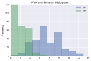
- He averages 7.2 strikeouts and 1.8 walks per game.
I also created a few visualizations to better understand a handful of selected elements in the data.
Unsurprisingly, the strikeout and walk histogram tells a positive story – comparatively low walks and comparatively high strikeouts.
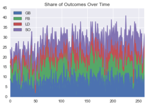
The share of play outcomes (ground ball, fly ball, line drive, and strikeout) has held relatively stable over time, though it looks like strikeouts per game has slightly increased.
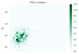
Kershaw’s average pitch location – in terms of horizontal and vertical placement – is fairly concentrated. To note, the measurement units are in inches, so the variations observed in the graph are more minor than they might appear.
Time Series Analysis
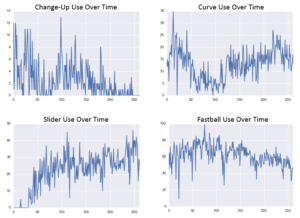
Without question, Kershaw has altered his pitching behavior over time. In the four charts below, we see a number of interesting patterns.
- Kershaw’s use of his change-up has fluctuated over time. The pitch was most popular in the early and middle parts of his career, though he’s essentially phased it out recently.
- He heavily declined use of his curveball in the early-mid section of his career, but its seen resurgence in recent seasons.
- Use of the slider increased steadily early in his career and has since mostly held stable.
- Fastball use has declined slightly over time, though it has been the most stable of his four major pitches.
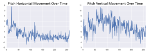
As Kershaw has fine-tuned his mix of pitches, he has experienced changes in average pitch movement over time. Horizontal movement has slightly declined over time, and average vertical movement has also declined in recent seasons. (Again, the charts show per-game averages, so some important nuance is missing).
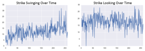
Though average pitch movement has, in general, declined, Kershaw has been getting more swinging strikes over time. This could be due to more effectively mixing pitches or better control.
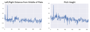
One last note, by inspecting the charts below, we see the average location of Kershaw’s pitches has held relatively stable over time.
Visualization by Selected Pitch Outcomes
On the surface, it appears Kershaw’s mix of pitches impacts items like the number of swinging strikes or ground balls, though I concede that games with more curveballs might have more swinging strikes simply because Kershaw threw more pitches in those games.
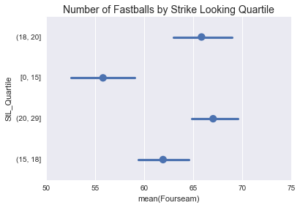
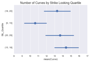
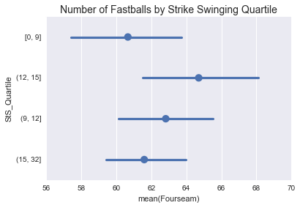
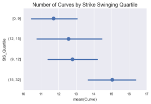
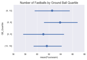
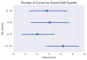
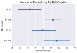
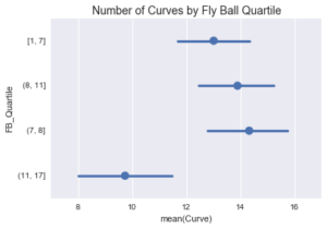
The following charts display the mean number of either fastballs or curveballs segmented by quartile for strikes looking, strikes swinging, ground balls, and fly balls. Essentially, these charts help us to understand if games with a higher number of fastballs or curveballs correspond to certain play outcomes.
In general, a greater number of fastballs corresponds with more strikes looking but does not really correlate with strikes swinging. A larger number of fastballs also seems to encourage more fly balls but doesn’t appear to impact ground balls as strongly. Games with the fewest curveballs have the lowest number of strikes looking, whereas games with the most curveballs have the highest number of strikes swinging. Interestingly, games with the highest number of fly balls have the fewest curves; the number of curves doesn’t appear to impact the volume of ground balls.
Clustering Results
So far, we’ve analyzed Kershaw’s career by slicing and dicing the data in ways we deemed valuable. However, this approach induces potential bias into the analysis. Luckily, we have unsupervised learning, in the form of cluster analysis, as another avenue to help us understand commonalities among Kershaw’s performances.
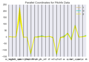
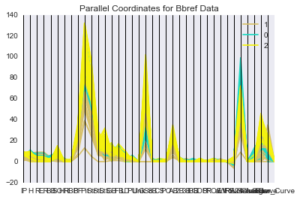
For this component of the analysis, I leveraged a k-means cluster, instructing the algorithm to find three groups of games. Below are two parallel coordinates plots of the k-means cluster results. Granted, these are difficult to read since we’re trying to visualize so much data at once. Basically, we are looking for groupings of data represented by the colors in the charts. How much do they overlap? We see there is little differentiation in the Pitchfx data, though clear differences exist in the Baseball Reference data. Below is a short summary of the key elements for each cluster.
- Cluster 1: 104 games; 1.95 earned runs on 6.5 innings pitched on average; fewer curveballs and more fastballs compared to other clusters.
- Cluster 2: 50 games; 2.42 earned runs on 4.5 innings pitched on average; more walks and fewer sliders compared to other clusters.
- Cluster 3: 108 games; 1.27 earned runs from 7.5 innings pitched on average; more line drives, more strikes swinging, and fewer walks compared to other clusters. Interestingly, in games where Kershaw allows more line drives, his performance is actually best.
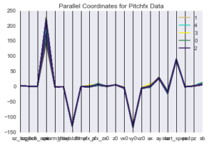
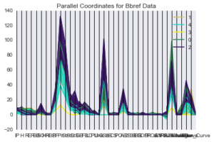
I also employed hierarchical clustering as another way to approach the data. Like with the k-means cluster, few differences exist in the Pitchfx data. However, we notice some divergences in the Baseball Reference data. Below is a short summary of the key elements for each cluster.
- Cluster 1: 88 games; 2.14 earned runs from 6.5 innings pitched on average ; more fastballs, more fly balls, and more strikes looking than other clusters.
- Cluster 2: 47 games; 2.19 earned runs from 5.2 innings pitched on average; more change-ups and more walks compared to other clusters.
- Cluster 3: 111 games; 1.32 earned runs from 7.5 innings pitched on average; more curveballs, sliders, strikes swinging, and strikeouts than other clusters.
- Cluster 4: 1 game (interesting the algorithm only picked out one game)
- Cluster 5: 15 games; 1.53 earned runs from 4.2 innings pitched on average
In many ways, the cluster results are a function of how deep Kershaw went into games. The better he pitched, the longer he lasted. The longer he lasted, the better his statistics were.
Prediction of Earned Runs Allowed
Lastly, I analyzed the difference between “low” and “high” earned run games. In my book, a “low” earned run game is classified as a game with three or fewer earned runs. And, you guessed it, a “high” earned run game is classified as a game with four or more earned runs.
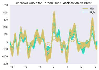
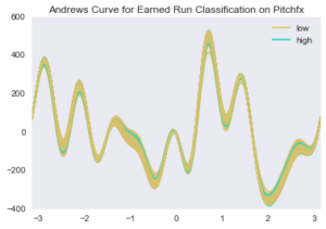
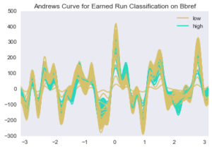
I first leveraged Andrews Curves to visualize the differences among “low” and “high” earned run games. Essentially, we want to see how much the colors overlap. In the Andrews Curve for the Pitchfx data, the colors overlap quite a bit, indicating little difference among the two classes. However, less overlap exists in the Baseball Reference data.
To add rigor to the analysis, I employed a popular machine learning technique, the random forest, which is among the best performing algorithms in the industry.
I defined the earned run classification as the dependent variable and used slightly more than 50 predictor variables, excluding a few variables from the original dataset such as Bill James’s Game Score that would basically tell the algorithm the answer. Overall, the random forest performs fairly well, with an accuracy score of 76% on games from the validation set. The two most important variables in the algorithm are innings pitched and strikeouts. This is consistent with earlier analysis; Kershaw goes deep into games when he pitches well, which allows him to rack up impressive in-game statistics (like strikeouts).
Questions? Thoughts? Leave them for me in the comments section!